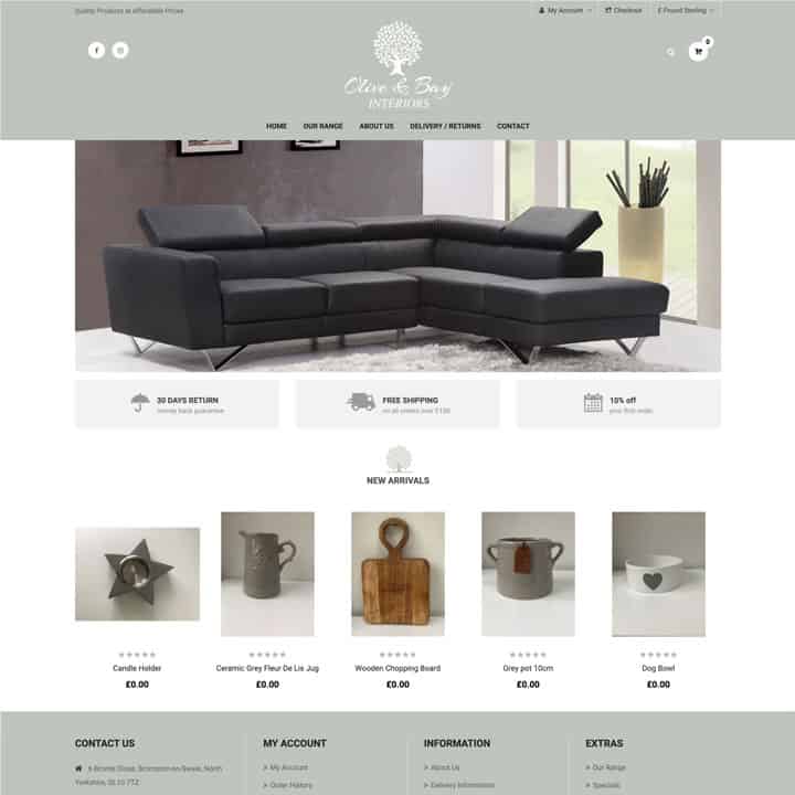
Olive & Bay first contacted JPS Media regarding building a website where they could sell they products online. We sat and discussed the different options with Olive & Bay. We soon decided that the most appropriate website for them would be a shopping cart website. A shopping cart website would allow Olive & Bay to reach as many customers as possible. We wanted to make sure this website was easy to use and easy to navigate around. If we made the website too complicated the user would click away and use the website of a competitor. This would, obviously be detrimental to our client’s business. Therefore, we not only ensured that the website was easy to use, but was also aesthetically pleasing.
We used subtle pastel colours on this website in order to avoid visual distress to the user. This is because we wanted the user to enjoy visiting the website and we wanted them to be able to browse the website for as long as they wanted. If the website caused visual distress to the user, they wouldn’t browse the whole website, meaning that our client could lose potential customers. Therefore, we made sure that the website looked beautiful and eye-catching.

Olive & Bay are a mother and daughter duo who wanted to use their passion for all things home to build an online business. They put home interiors at the heart of everything they and use their passion to hand pick the products on their website. They want their products to be beautiful and of a high quality. They also want their customers to love their products as much as they both do.
Olive & Bay contacted us for a website that would showcase their products in a classy and beautiful way. We discussed their options and decided that the most appropriate website would be a shopping cart website. This is because a shopping cart website is the official storefront of a business online. A shopping cart website is a fast and convenient way for a businesses customers to order products online. Payments to a company is easy, meaning that the user does not even have to leave the house in order to purchase products. The ease of purchasing products online through a shopping cart website increases the chance that the customer will order more products. It also encourages return customers.
We enjoyed working with Olive & Bay and feel that the website that we have built from is easy to use and navigate around. We ensured that the customers could easily buy the products from the website without any stress and hassle. This will encourage them to return to the website to buy more products. JPS Media also understand that our clients want to be able to manage their website easily. They want to see what product is popular, and also be able to manage their orders in a professional and timely manner. Therefore, we designed the back end of this website in way that allowed Olive & Bay to see their orders and manage them correctly. We understand that this is an important feature of any website for all our clients. We aim to make the life of our clients as stress free as possible.
To provide the best experiences, we use cookies to assess device information. Not consenting or withdrawing consent, may adversely affect certain features and functions.