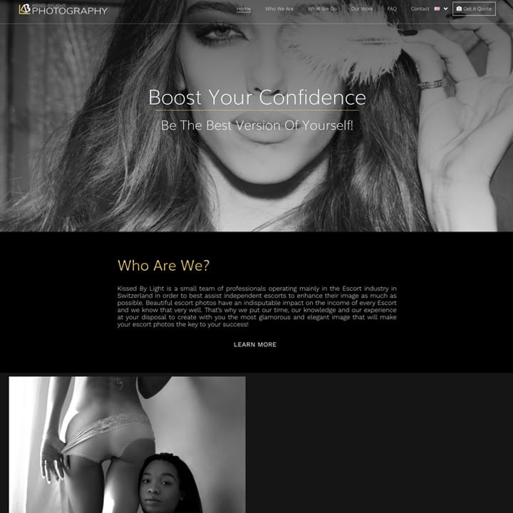
Kissed By Light came to us to build them a beautiful and elegant website that showcases the services they have to offer. We wanted to keep the design of the website classy and sophisticated. This is why we used a lot of black and different shades of grey throughout the website. We kept all of the images discrete and sexy and ensured that we didn’t use any images that would offend the users.
The most important request made by Kissed By Light was that the website was bilingual. We, therefore, ensured that we built in an option on the website so the user could choose which language they viewed the website in. We made this feature easy to use so that it was simple for the user to switch between the seven different languages available.
Kissed By Light also requested that we designed a simple, yet distinct logo for their company. We only used gold and white to ensure that the logo wasn’t too busy or complicated. We used the first letter of each word in the name of our client in the design of the logo. This kept the logo simple and made it recognisable to Kissed By Light. We continued the gold colour from the logo throughout the site so that we could built up a brand on the website.

To provide the best experiences, we use cookies to assess device information. Not consenting or withdrawing consent, may adversely affect certain features and functions.